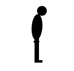
A Simple Walking Man CSS3 Animation Tutorial
CSS3 is great way to Create Animations, we can replace flash Animations,Animated images and JavaScript with CSS3 Animation properties.
In this CSS3 Animation Tutorial I will explain how to create Walking Man Animation Effect Using CSS3 alone as shown below.
At the end of this post you will understand following CSS3 Animation Properties.
- CSS3 KeyFrame Animation : property which allows us to create animations.
- CSS3 Transform : property which allows us to rotate,scale,skew,move elements.
- CSS3 Transform Origin : property which sets the origin of transformations
First we will create static man here is the sample HTML code
<div id='WalkingMan'>
 <div class='ManBody'>
	<div class='body'>
                <p class='Manhead'></p>
		<p class='Middlepart'></p>
		<p class='Lhand'></p>
		<p class='Rhand'></p>
	</div>
	<p class='LLeg'></p>
	<p class='RLeg'></p>
 </div>
</div>
We divided man into two parts
- Man Body which contains Head , chest and Hands.
- Man Legs
Now we will apply CSS
.ManHead
{
	width: 20px;
	height: 20px;
	border-radius: 50%;
	background: #000;
}
.MiddlePart
{
	background: #000;
	height: 40px;
	width: 10px;
        border-radius: 100%;
	-webkit-transform: scale(2.2,1.3) skewY(-30deg);

}
.LHand,.RHand,LHand,RHand
{
       height: 50px;
       width: 5px;
       background: #000;
}
The CSS code is straight forward except transform property(For Middle Part)
- Skew property turns element at an given angle,depending upon parameters X or Y axis
-webkit-transform: skew(30deg,20deg);
In our example I used skewY which turns element vertically(Y-axis) -30 deg.
- And scale property increased or decreases the element size, depending on the parameters given for the width (X-axis) and the height (Y-axis)
The above code creates sample body parts as shown below

CSS3 Animation
Now we have to align all this body parts to create man
Apply the following CSS Code.
#WalkingMan {
	background: #FFF;
	width: 700px;
	height: 150px;
	margin: 50px auto;
	text-align: center;
}
.body {
	float:left;
	position: absolute;
}

.Manhead {
	width: 20px;
	height: 20px;
	border-radius: 50%;
	background: #000;
	position: absolute;
	margin-top: 15px;
	margin-left: 0px;
}

.Middlepart {
	background: #000;
	height: 40px;
	width: 10px;
	position: absolute;
	margin-top: 38px;
	margin-left: -5px;
	border-radius: 100%;
	-webkit-transform: scale(2.2,1.3) skewY(-30deg);
}
.Lhand, .Rhand {
	margin-top: 38px;
	margin-left: -5px;
	height: 50px;
	width: 5px;
	background: #000;
	float:left;
}
.LLeg, .RLeg {
	margin-top: 80px;
	margin-left: -5px;
	height: 50px;
	width: 5px;
	background: #000;
	float:left;
}
.ManBody
{
margin-left: 350px;
}
This will create the static Man as shown below.

CSS Animation
Now we apply CSS3 KeyFrame rule property to move this man.
What is CSS3 KeyFrame rule?
This property allows us to Create Animations Using CSS3. Keyframe property supports all major browsers (IE 10+) and for safari chrome we have to prefix corresponding browser engine
To create Animations follow below two steps
- First Define CSS styles inside the @keyframetag
- Now apply the rule to the element using animation property.
Observe the below sample CSS3 KeyFrame Animation Example which changes the div color to red to yellow for every 5 sec
<!DOCTYPE html>
<html>
<head>
<style>
div
{
width:100px;
height:100px;
background:red;
-webkit-animation:myfirst 5s alternate infinite ease-out;
}
@-webkit-keyframes myfirst
{
from {background:red;}
to {background:yellow;}
}
</style>
</head>
<body>
<div></div>
</body>
</html>
We defined a @keyframe with name “myfirst” We are changing from red to yellow.And applying the animation property on div with duration. You must specify the duration otherwise animation wont effect because default value is ‘0’
We can use keywords like “from” and “to” for changing styles or we can specify change in percent 0% means “first” and 100% means “to”
0% is the beginning of the animation and 100% is when the animation is complete. Visit W3schools for more details.
Now come to our CSS3 Animation Demo
I divided animations into two parts
- Moving hands and Legs
- Moving Entire Body
For Moving Hands Apply the Following CSS
.Lhand, .RLeg {
	-webkit-transform-origin: 0 0;
	-webkit-animation: movement1 0.5s alternate infinite ease-out;

}
.Rhand, .LLeg {
	-webkit-transform-origin: 0 0;
	-webkit-animation: movement2 0.5s alternate infinite ease-in;
}

/* for movement 1 */
@-webkit-keyframes movement1
{
	from {
		-webkit-transform:rotate(-30deg);
	}
	to {
		-webkit-transform:rotate(30deg);
	}
}

/* for movement 2 */
@-webkit-keyframes movement2
{
	from {
		-webkit-transform:rotate(30deg);
	}
	to {
		-webkit-transform:rotate(-30deg);
	}
}
Right hand and left leg should sink with each other so applied same CSS3 Animation Effect for both elements and vice versa.
For moving hands I am using CSS3 transform rotate property from 30 degrees to -30 degree.
And I applied CSS3 transform-origin property as 0%(x-axis) 0%(Y-axis) which specify that with respect to element starting position we should apply the transformation.
i.e., we should rotate leg or hand at angle of 30 deg with respect element starting position.(Remove this property in demo example and check the animation you will understand in a better way).
And infinite means continuously we should apply the animation.
Here is the CSS3 Animation.
Only Legs and Hands are moving rite. Now we should move entire body for that purpose I applied following animation to manBody
.ManBody {
                margin-left:350px;
		-webkit-animation: ManBody 9s infinite ease-in;

	}
@-webkit-keyframes ManBody
{
	from {margin-left:30px;}
	to {margin-left:600px;}
}
The Logic straight forward simply we should apply the margin-left style 30px to 600px for every 9 sec.
Here is the Final Demo for Walking Man Effect Using CSS3 Animation.
NOTE: The above CSS is for Chrome and Safari which uses Webkit engine For Opera and IE10 No need to add any prefix and For mozilla add Moz prefix.
The Demo works fine with Chrome Safari Mozilla IE10 I have not tested with Opera I hope it will work.
Also Read: Google Hangout Effects using HTML5 Canvas
I hope you’ve enjoyed this CSS3 Animation Tutorial and that it gives you more ideas on CSS3 Animation effects.